Gear4Music Redesign
A conceptual redesign exploring how a large music catalogue could feel clearer, more focused and easier to navigate.
Role
UX/UI Designer
Category
UX/UI Redesign · E-commerce
Year
2024–25
Sound without
compro-mise.
An independent conceptual redesign exploring how Gear4Music's online shopping experience could feel clearer, more focused and more confident across desktop and mobile.
Context
Large e-commerce catalogues must support very different customers, from beginners exploring their first instrument to experienced musicians searching for a specific product. This concept focuses on reducing visual competition and creating a more structured route from discovery to checkout.
My Role — UX/UI Designer
- Heuristic review
- Competitive review
- Information architecture
- User-flow planning
- Wireframing
- Visual design
- Interactive prototype
Areas of Opportunity
Findings from a heuristic review of the live site against standard usability heuristics and competitor patterns.
Competing Visual Priorities
Promotional banners, navigation elements and product content compete for attention, making it difficult to identify the primary action.
Complex Product Discovery
A large catalogue requires clearer category relationships and stronger support for both browsing and direct search.
Inconsistent Trust Information
Delivery, returns and availability information should remain visible at important purchase decisions.
Mobile Hierarchy
Desktop navigation patterns need to be reconsidered for smaller screens rather than simply compressed.
Design Challenge
How might we
How might a large music catalogue support confident product discovery without overwhelming the customer?
Key Design Decisions
Search as a discovery tool
Search was expanded into a browse-first experience that allows customers to move from major categories to subcategories and products.
Reduced navigation
The mobile navigation focuses on four essential actions: home, search, basket and menu.
Visible purchase information
Delivery, availability, returns and the running order total remain visible at relevant decision points.
Consistent product cards
Product imagery, pricing, status badges and calls to action follow one repeatable hierarchy.
Dark visual direction
The dark interface was chosen to give product photography greater visual focus and create a distinctive music-focused identity. This is a visual design decision, not a proven performance improvement.
Core Shopping Flow
Homepage
Hero, category entry points, product rails, footer
Browse Categories
Category Discovery
Browse-first search: categories, then subcategories, then products
Product Details
Price, specs, Add to Basket, delivery/returns trust strip
Basket → Checkout
Running order summary stays visible through every checkout step
The Palette
Dark-first. Every color chosen for contrast, warmth, and clear semantic role.
Obsidian
#0D0D0D
Page Background
Charcoal Surface
#161616
Card / Panel
Raised Surface
#1E1E1E
Secondary Surface
Burnt Sienna
#C8561A
Primary / Brand
Warm Amber
#D4962A
Accent
Warm White
#F0EFEA
Foreground
Subdued
#8A8A82
Muted Foreground
Hairline
#1F1F1F
Border
Contrast Ratios — WCAG AA
Aa 16.5:1
Warm White on Obsidian
PASSAa 4.6:1
Burnt Sienna on Obsidian
PASSAa 5.8:1
Warm Amber on Obsidian
PASSAa 14.1:1
Warm White on Card
PASSAa 4.7:1
Subdued on Obsidian
PASSAa 4.5:1
White on Burnt Sienna
PASSType Hierarchy
Three families with one purpose each. No redundancy, no decoration.
Big Shoulders Display
STRATOCASTER
Figtree
Free UK & Ireland delivery
DM Mono
NEW · €1,299.00
Building Blocks
12 core components covering every interaction state in the purchase journey.
Primary Button
Ghost Button
Product Card
Sale Badge
Cart Badge
Search Overlay
Slide Menu
Hero Carousel
Category Tile
Brand Logo Grid
Toast Notification
Stat Counter
Live Demos
Buttons
Product Card
Fender
Fender Stratocaster
Yamaha
Yamaha P-145B
Roland
Roland TD-17KV
Shure
Shure SM7B
Badges & States
Toast Notification
Added to Basket
Fender Stratocaster · €1,299
Final Solution
Real, exported screens from the finished build, running end to end rather than sitting still.
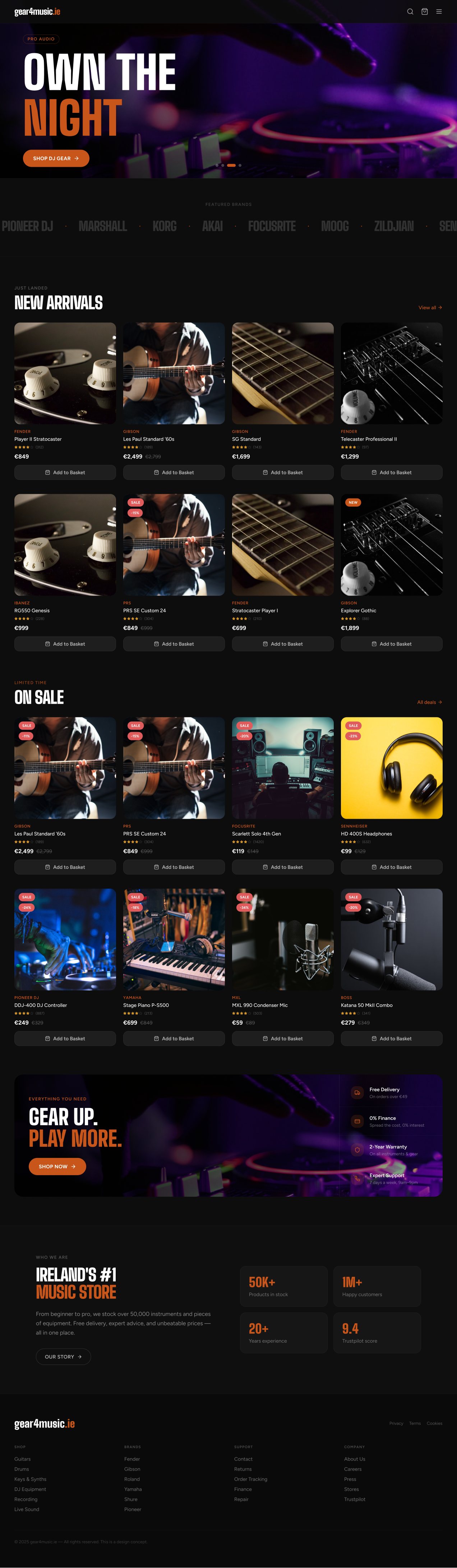
Homepage
Hero, featured-brand strip, New Arrivals, On Sale, trust banner, and footer — the full scroll, looping.
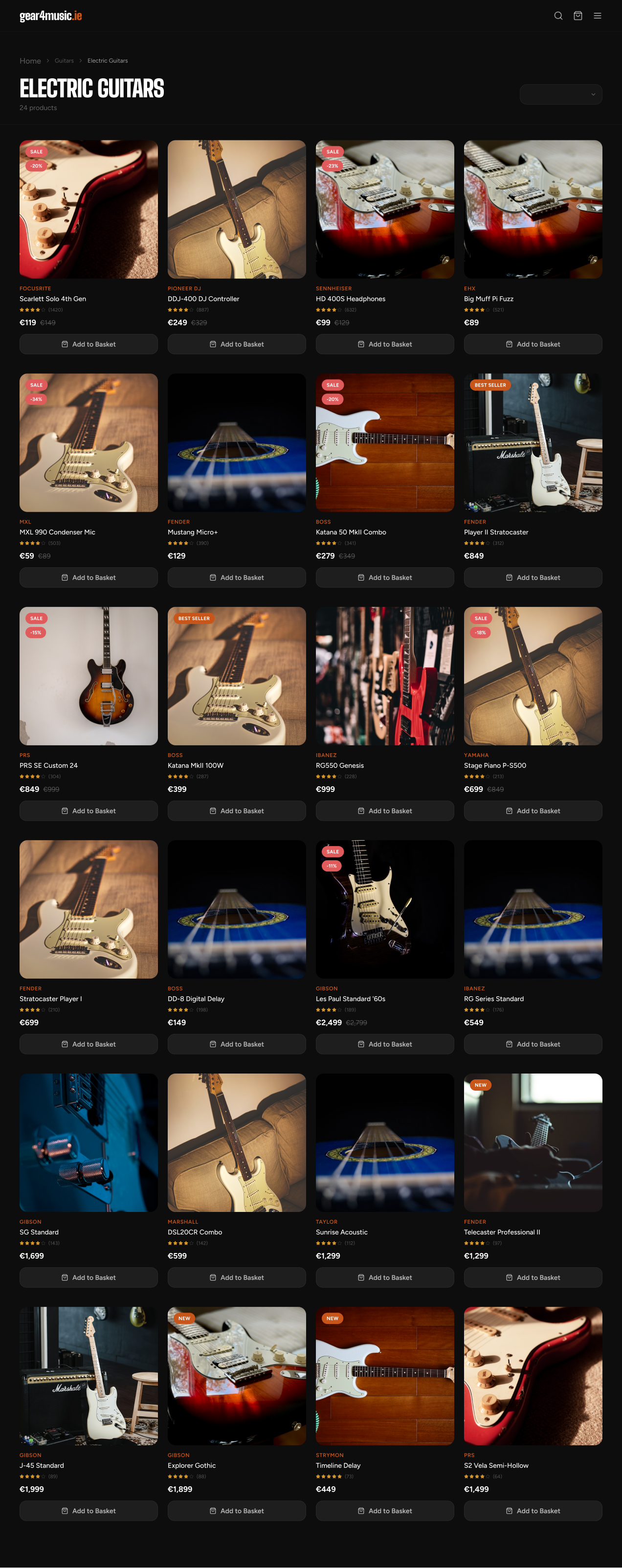
Category — Electric Guitars
24 products with Sale, Best Seller, and New badges — pricing shown the same way on every single card.
Checkout, Made Honest
The old checkout kept the true cost a secret until the very last screen — shipping and fees showed up as a surprise right before payment. The rebuild keeps a running order summary — subtotal, delivery, total — visible on every single step, next to a clear 4-step progress bar. Nothing hidden, nothing sprung on you at the till.
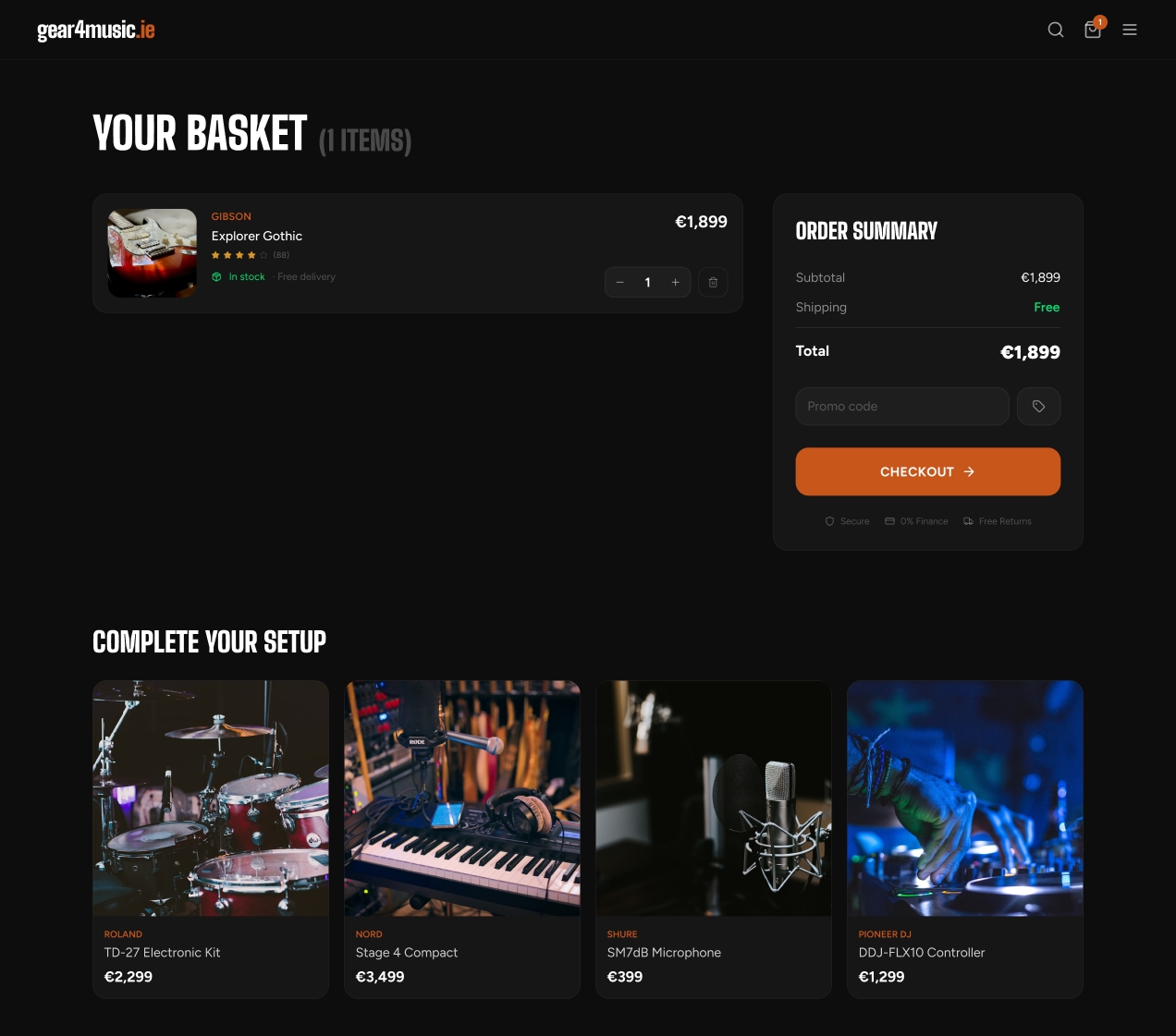
01 — Basket
Subtotal, delivery, and total — visible immediately
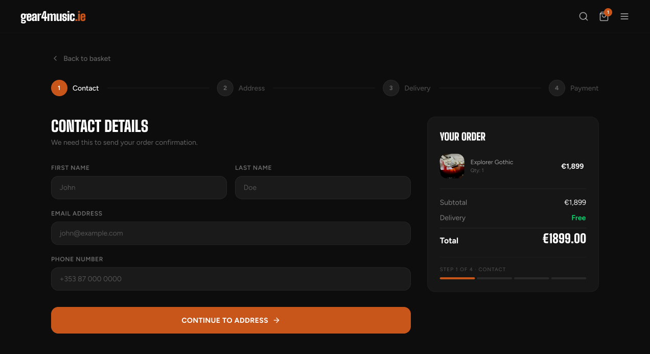
02 — Contact
Step 1 of 4
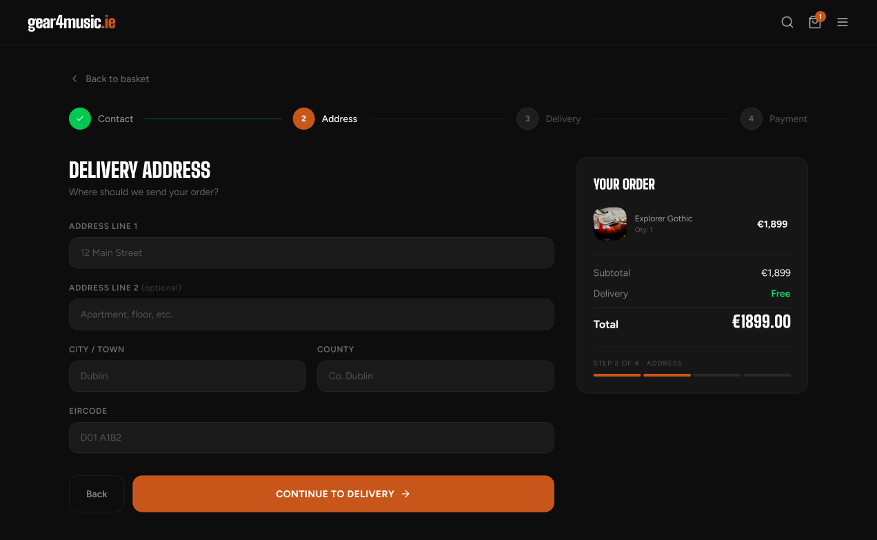
03 — Address
Step 2 of 4
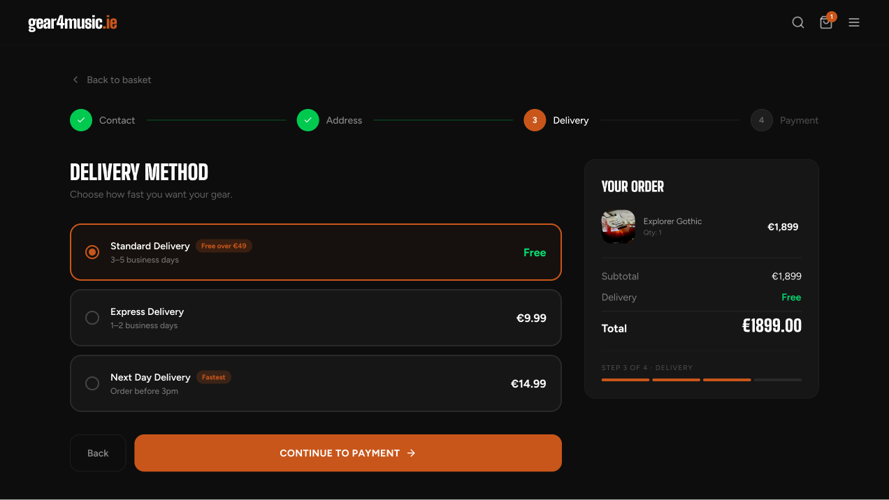
04 — Delivery
Step 3 of 4 — every option's cost shown upfront
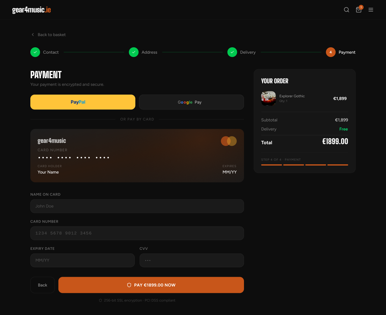
05 — Payment
Step 4 of 4 — total restated before paying
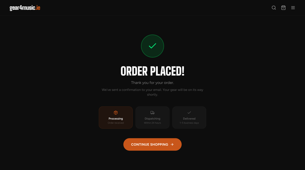
06 — Confirmation
Processing → Dispatching → Delivered
01 — Basket
Subtotal, delivery, and total — visible immediately
02 — Contact
Step 1 of 4
03 — Address
Step 2 of 4
04 — Delivery
Step 3 of 4 — every option's cost shown upfront
05 — Payment
Step 4 of 4 — total restated before paying
06 — Confirmation
Processing → Dispatching → Delivered
The Shopping Journey
From browsing to basket, every screen carries the same pricing, badges, and CTA pattern — so trust builds quietly the whole way through, not just at checkout.
01 / 04
Browse
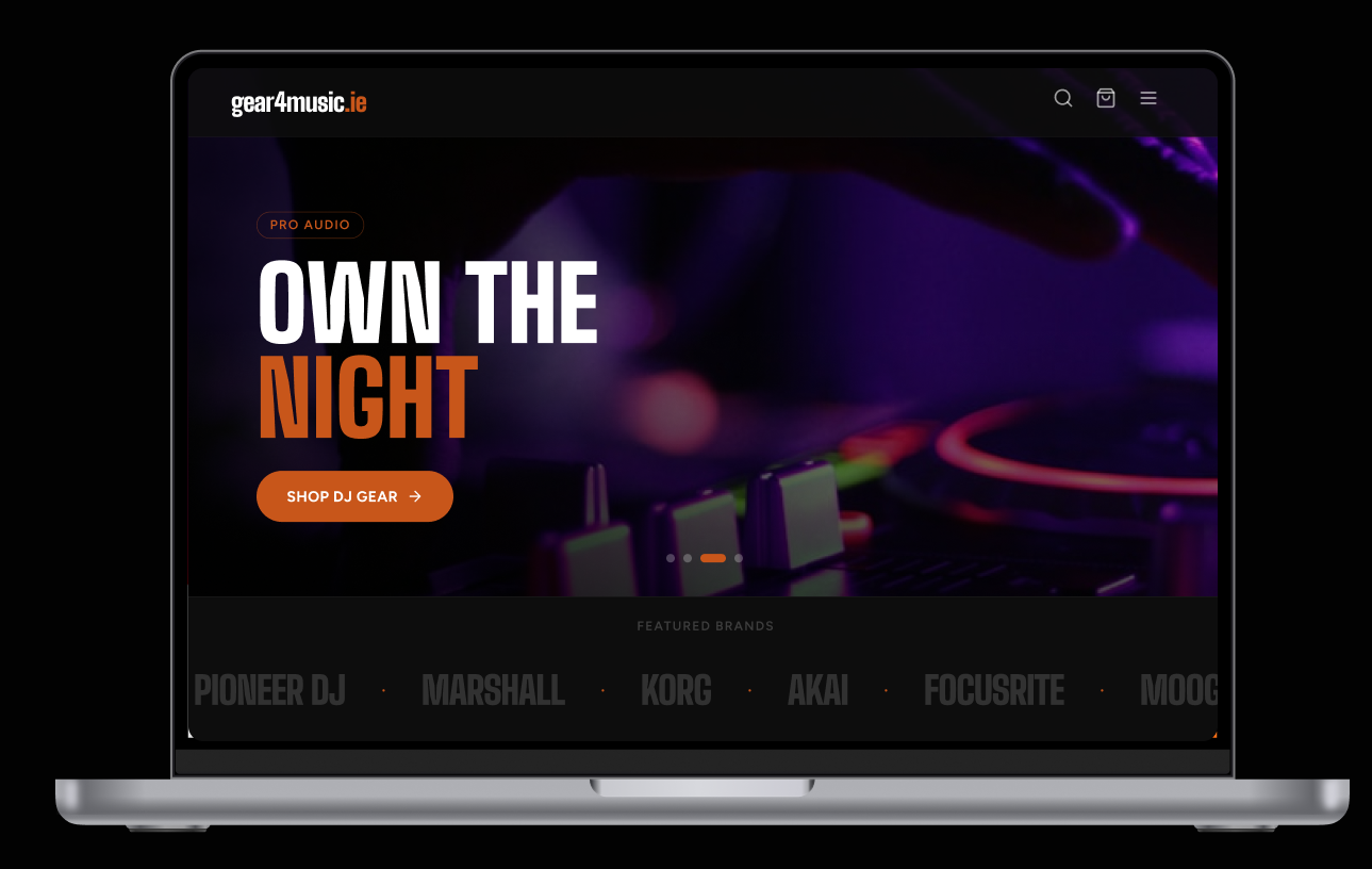
The “Own the Night” campaign hero leads with a full-bleed pro-audio shot, one clear CTA, and a scrolling brand strip underneath.
Outcome
The final concept covers the main shopping journey from product discovery to order confirmation. It also includes a reusable component system for navigation, product cards, status badges, buttons, search and checkout.
Dark-First
Lower eye strain in studio and stage environments where musicians actually shop.
Search = Browse
The search overlay functions as the primary navigation tool, not a keyword box.
Signal Over Noise
Every element earns its place. Promotional clutter replaced by confident hierarchy.
Craft at Scroll
Micro-animations and hover states reward attention without distracting from the product.
12 — Reflection
The strongest improvement was creating a more consistent path through a large catalogue. The next step would be usability testing with beginner and experienced musicians to compare browsing behaviour, search expectations and checkout comprehension.