Pluto
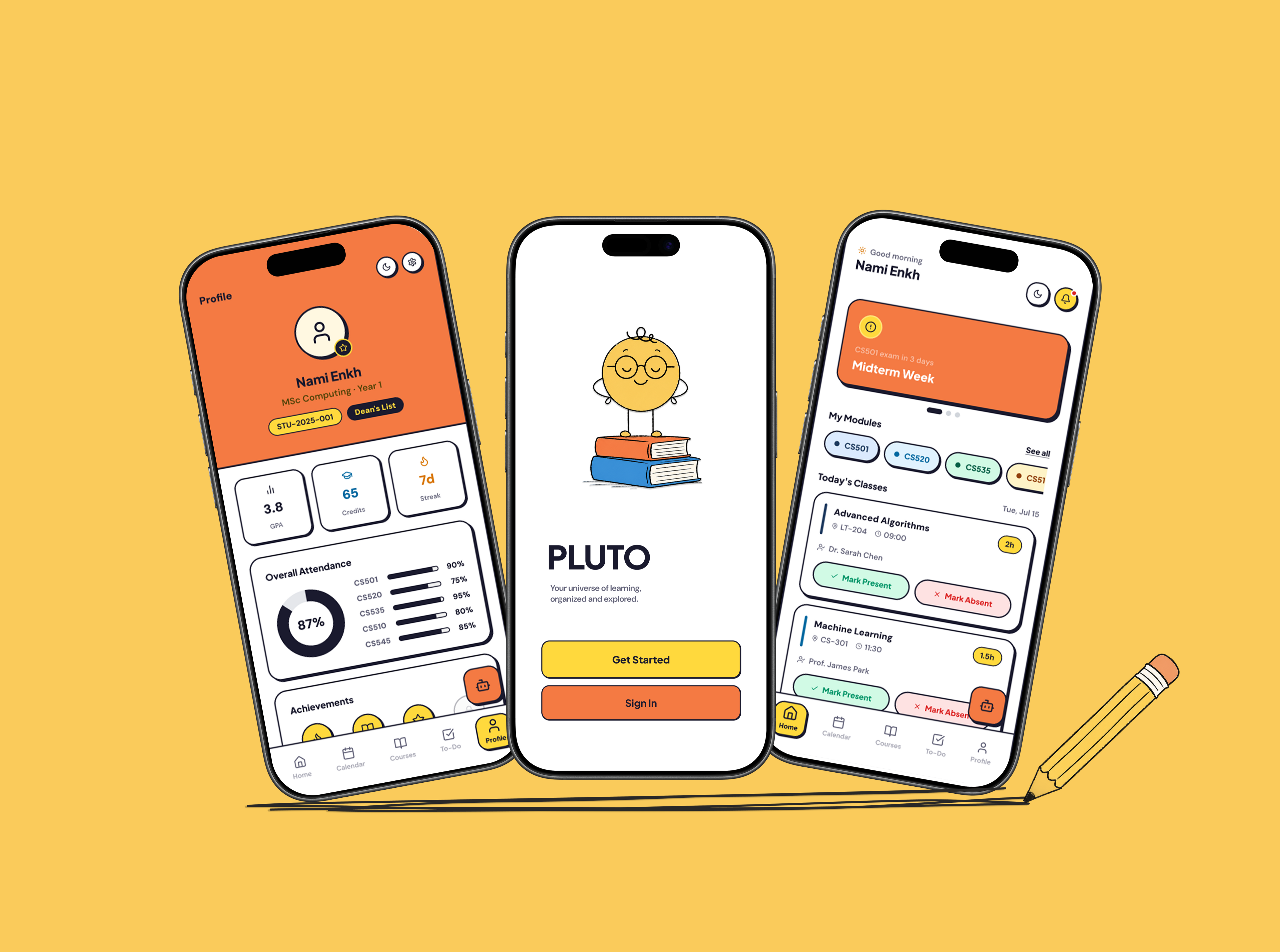
A student portal concept designed to bring classes, deadlines, coursework and daily tasks into one clear mobile experience.
Role
UI/UX Designer
Category
Product Design · Mobile App
Year
2026
Project Introduction
Pluto is a student portal concept that brings classes, deadlines, coursework and daily tasks into one mobile experience. The project explores how students could understand what needs their attention without moving between several disconnected tools.
The Problem
Student information is often distributed across timetables, learning portals, emails, group chats and personal to-do lists. Moving between these tools makes it harder to understand what is happening today, what is due next and which tasks require immediate attention.
Project Goal
Design one clear home base where students can quickly check their schedule, coursework and priorities.
My Role
UI/UX Designer
- Product concept
- Interface exploration
- User-flow planning
- Wireframing
- Visual design
- Component system
- Interactive prototyping
Exploration
I reviewed the common tools students use to manage classes and coursework. This helped me identify an opportunity to connect schedule information, deadlines and personal tasks within one consistent experience.
Timetable app
Shows the schedule, nothing else
University LMS
Assignments buried in a portal
Group chat
Deadlines get lost in the scroll
Generic to-do app
Disconnected from any of it
Information Architecture
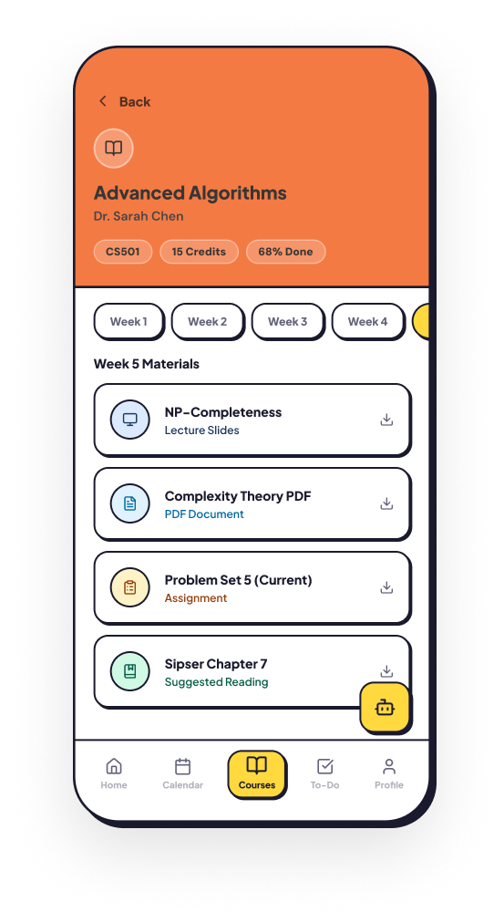
The structure centres on a today-first home dashboard, with Calendar, Courses and To-Do as the other main tabs. Each course opens into its own drill-down screen combining sessions, coursework and progress, so nothing sits more than a couple of taps from the dashboard.
Wireframes
Mid-fidelity wireframes showing screen anatomy, navigation structure, and component placement across all 8 screens.
Auth Flow
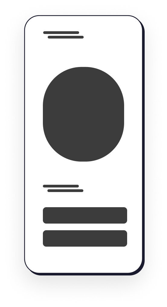
Welcome
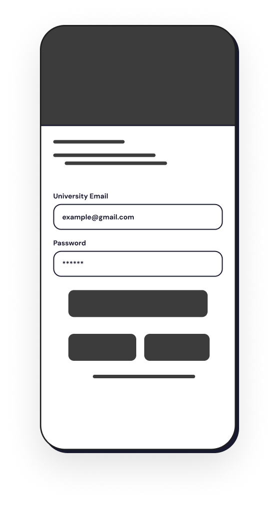
Login
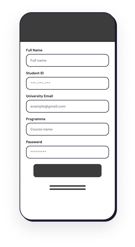
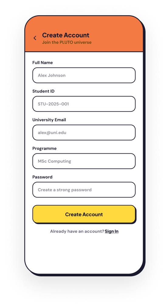
Register
Main App — Tab Screens
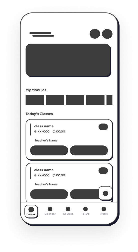
Home
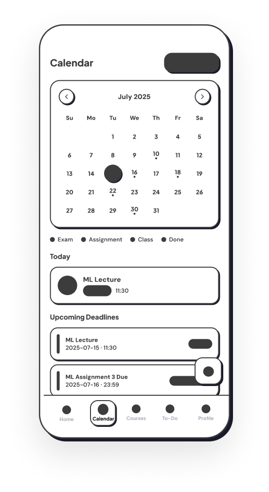
Calendar
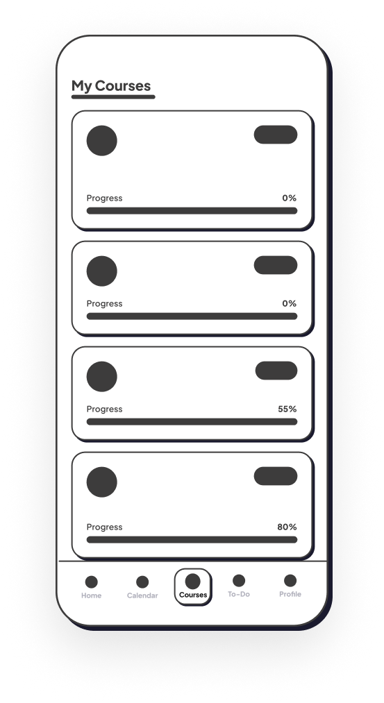
Courses
AI Assistant & Drill-Down Screen
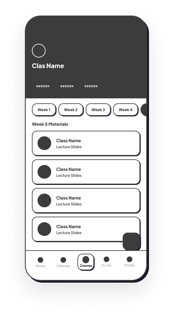
Course Detail
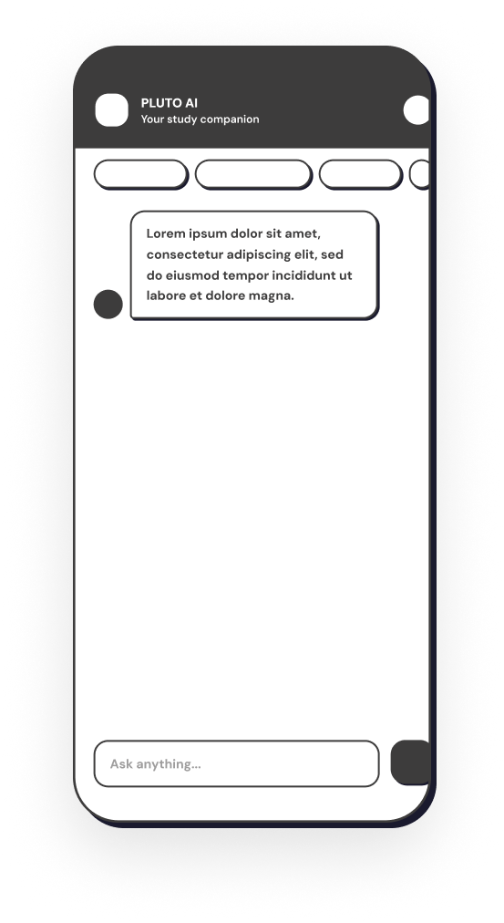
Pluto AI
Key Design Decisions
Today-first dashboard
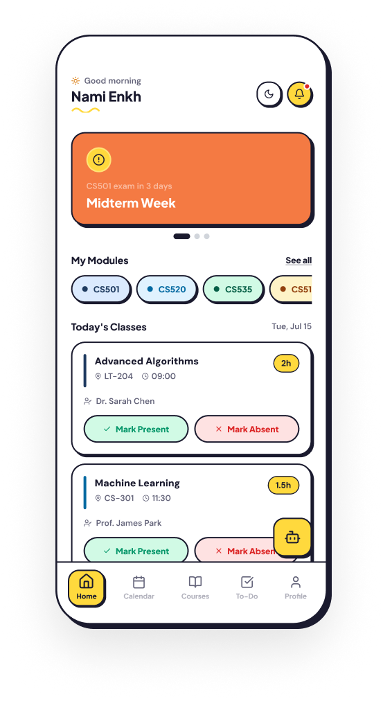
The home screen prioritises today's classes, approaching deadlines and incomplete tasks so students do not have to search for urgent information.
Consistent colour coding
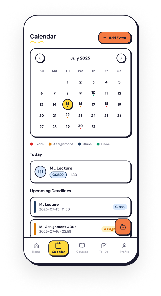
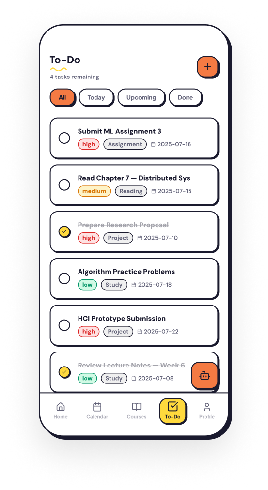
Classes, assignments, exams and completed tasks use distinct semantic colours across the app.
Connected course information
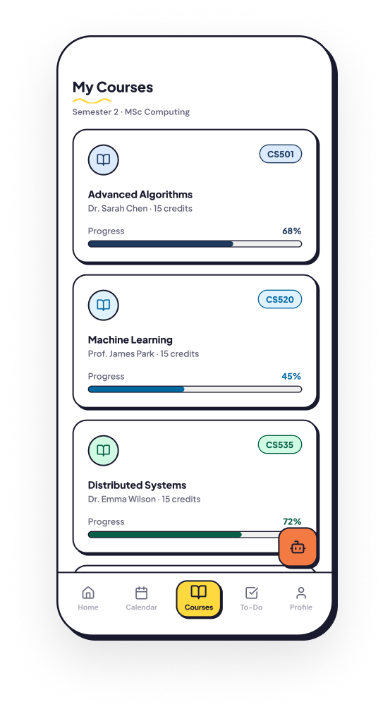
Each course combines upcoming sessions, coursework and progress information instead of separating them across different tools.
Focused AI assistance
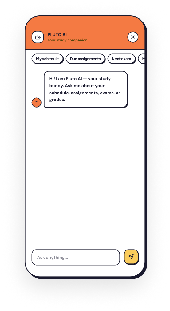
The AI assistant is positioned as a shortcut for questions about the student's own schedule, courses and deadlines, rather than as a general-purpose chatbot.
Color System
Core Palette
Pluto Yellow
#FFD93D
Primary accent, CTAs, highlights
Ink
#1A1A2E
Headings, borders, shadows
Canvas
#FDFAF4
App background, warm white
Card White
#FFFFFF
Card surfaces, modal backgrounds
Muted
#64647A
Secondary text, captions
Surface
#F0EDE6
Input fills, inactive states
Semantic Colors
Exam / Danger
#DC2626 · BG #FEE2E2
Exam deadlines, critical alerts
Assignment
#D97706 · BG #FEF3C7
Homework, upcoming tasks
Class
#1E3A5F · BG #DBEAFE
Scheduled lectures, sessions
Completed
#059669 · BG #D1FAE5
Done items, success states
Typography
Plus Jakarta Sans
AaBbCcDdEeFfGg
0123456789 !@#
DM Sans
AaBbCcDdEeFfGg
0123456789 !@#
Components
Buttons
Cards
Standard Card
2px offset shadow — main workhorse
Dark Card
Dark mode surface (#252525)
Accent Card
Yellow hero cards and carousel banners
Status Tags & Badges
Navigation Bar
Spring physics sliding pill — layoutId="nav-pill" · stiffness: 460 · damping: 32
Final Experience
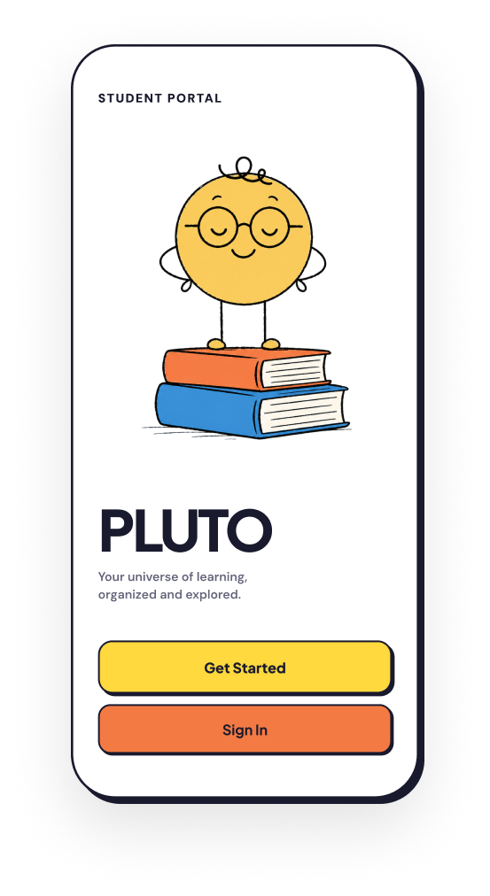
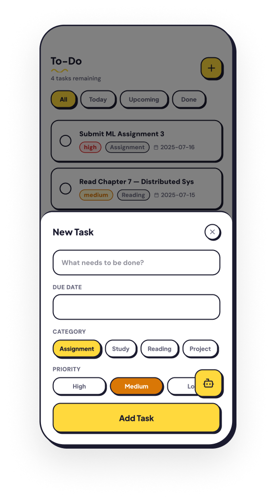
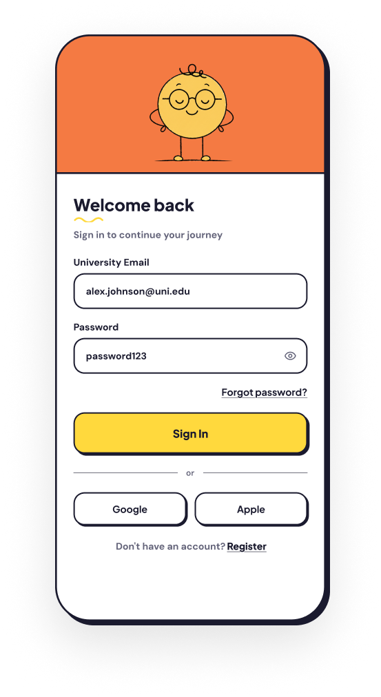
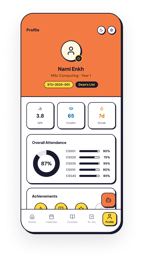
The finished screens — dashboard, calendar, courses, tasks, profile and the Pluto AI assistant.
Prototype Evaluation
I reviewed the interactive prototype across the main task flows, including checking today's schedule, viewing coursework, creating a task and asking the assistant about a deadline. This helped me identify areas where navigation labels, spacing and information hierarchy needed greater clarity.
Outcome
The final concept includes a connected student dashboard, calendar, course area, task manager and focused AI assistant. The project strengthened my ability to organise a multi-feature product into a consistent mobile system.
Reflection
If I continued the project, the next step would be moderated usability testing with students. I would focus on whether the dashboard communicates priorities quickly and whether users understand the boundaries of the AI assistant.